Six palettes carry the 2026 EVA tote season: coastal neutrals, saturated candy brights, deep marine tones, sunset gradients, garden greens and soft pastels. Colour is not only a styling decision in this category, because surface temperature and light fastness move with it: a black body passes sixty degrees within an hour in direct summer sun while a pale shell body stays close to ambient, and a mid-tone compound tested to grey scale grade 4 holds its shade for roughly two tropical seasons. Plan three to five colourways per size, hold one neutral as the volume driver, and match charms to the body rather than to the season.
Why Colour Is a Specification, Not Only a Style Choice
In most soft goods categories colour is a styling decision made late and changed freely. In a moulded closed-cell body it is made early and changed slowly, because each colourway is a compound batch with its own recipe, its own light fastness behaviour and its own minimum order. A colour decision here locks a purchase order rather than a mood board, and the consequences show up in heat behaviour and in fading long after the season has moved on.
Two physical effects do the work. Dark compounds absorb more solar radiation, so surface temperature rises and the body becomes less comfortable to lift and slightly more prone to creep under sustained load. And certain pigment families, particularly bright organic reds and some fluorescent tones, fade faster under ultraviolet exposure than mineral-based earth tones. Both effects are measurable, and both should be part of a colourway decision rather than a surprise in year two.
| Colour family | Surface temperature in peak sun | Light fastness behaviour | Best use |
|---|---|---|---|
| White and off-white shell | Ambient plus 4 to 8 degrees | Excellent, minor yellowing risk | Volume driver, resort and spa |
| Pale sand and stone | Ambient plus 6 to 11 degrees | Excellent | Neutral anchor for any range |
| Mid-tone marine blue | Ambient plus 12 to 18 degrees | Very good at grade 4 or better | Year-round coastal retail |
| Saturated candy pink | Ambient plus 14 to 20 degrees | Good, some shift after two seasons | Seasonal capsule, gifting |
| Deep navy and charcoal | Ambient plus 22 to 30 degrees | Very good, shows dust | Shaded use, off-season, urban |
| Fluorescent tones | Ambient plus 16 to 24 degrees | Fair, visible fade within a season | Short promotions and events |
The practical rule that follows from the table is that the volume driver in a coastal range should be a light neutral and the accent should be one bright, with the deep tones reserved for shaded or off-season use. That is exactly the mix most successful ranges end up with, and it is arrived at more reliably by reading the physics than by following a fashion forecast.
Six Palettes That Carry the 2026 Season
The palettes below are working ranges rather than trend-board language. Each one lists the tones that actually ship, the setting it suits and the role it plays in a range, because a palette without a role is a colourway that will sit in a warehouse.
| Palette | Core tones | Setting it suits | Role in a range |
|---|---|---|---|
| Coastal neutrals | Shell, sand, driftwood grey, pale stone | Resort, spa, vacation rental | Volume driver, safest reorder |
| Candy brights | Hot pink, tangerine, aqua, lemon | Family beach retail, gifting | Seasonal accent and social content |
| Deep marine | Navy, teal, slate, deep green | Boating, marina, off-season | Premium tier and male-skew ranges |
| Sunset gradient | Coral, peach, dusty rose, warm gold | Resort boutique, event and wedding | Limited capsule, higher price band |
| Garden greens | Sage, olive, mint, deep fern | Garden centre, market tote, spring | Off-season and year-round carry |
| Soft pastels | Lilac, sky, butter, blush | Spa, kids, nursery and gifting | Second-tier accent, charm-friendly |
A range does not need all six. It needs one neutral palette, one bright palette and, if the channel supports it, one premium deep palette. Three palettes across three colourways per size produces a nine unit range that looks full on a shelf and keeps the opening order near 2,000 pieces, which is the size a first season can realistically absorb.
What Sells Where: Regional Preferences
Colour preference varies more by channel and climate than by country, but the regional patterns are consistent enough to plan around. Warm-climate coastal markets skew light and bright because dark bags are physically unpleasant to lift off hot sand. Northern and urban markets tolerate and often prefer deeper tones because the bag sees pavements, car boots and gym floors rather than noon sun.
| Market | Leading tones | Avoid or limit | Typical range mix |
|---|---|---|---|
| US Gulf and Florida coast | Shell, aqua, coral, hot pink | Charcoal, deep navy | 60 percent light, 30 bright, 10 deep |
| US Northeast and Great Lakes | Navy, slate, sage, sand | Fluorescent tones | 40 light, 20 bright, 40 deep |
| Mediterranean Europe | Stone, olive, terracotta, deep blue | Butter yellow | 50 light, 20 bright, 30 deep |
| Northern Europe | Sage, charcoal, blush, sand | Saturated candy tones | 35 light, 15 bright, 50 deep |
| Australia and New Zealand | Aqua, shell, tangerine, deep teal | Mid brown | 55 light, 35 bright, 10 deep |
| Caribbean and resort channel | Shell, sand, pale blue, coral | Anything dark | 75 light, 25 bright, 0 deep |
The resort row is worth noting because it is the most extreme and the least intuitive. A resort buyer will reject a dark bag outright, not for aesthetic reasons but because a guest lifting a bag at sixty degrees leaves a review. If your channel mix includes resorts, the deep palette simply has no place in it.
Finish Options: Solid, Marble, Two-Tone and Metallic
Beyond the base colour there are four finish treatments that change how a colourway reads, and each carries a different cost and a different minimum. Solid is the baseline and the cheapest. Marble mixes two compounds in the mould and produces a unique pattern per unit, which customers read as premium but which makes batch matching impossible. Two-tone splits body and handle across two compounds and reads as designed rather than mixed. Metallic adds a pearlescent or flake pigment and lifts the perceived price band by roughly 8 to 14 dollars at retail.
- Solid: lowest cost, easiest to reorder, matches exactly across batches. The correct choice for the volume driver.
- Marble: premium read, unique per unit, cannot be batch matched. Use for capsules where reorder is not planned.
- Two-tone: designed look, two compounds, small setup charge. Good for a brand that wants a signature without tooling.
- Metallic: highest perceived value, adds pigment cost, shows scratches more than a solid. Reserve for a gift tier.
- Matte versus gloss: matte hides scuffs better and reads more expensive in photographs; gloss cleans more easily.
The one finish to be careful with is marble on a volume colourway. Because no two units match and no two batches match, a retailer reordering a marble colourway will receive stock that looks different from the floor sample, and that leads to a return conversation. Marble belongs in a capsule where the whole point is that each piece is singular.
Coordinating Charms, Straps and Inserts
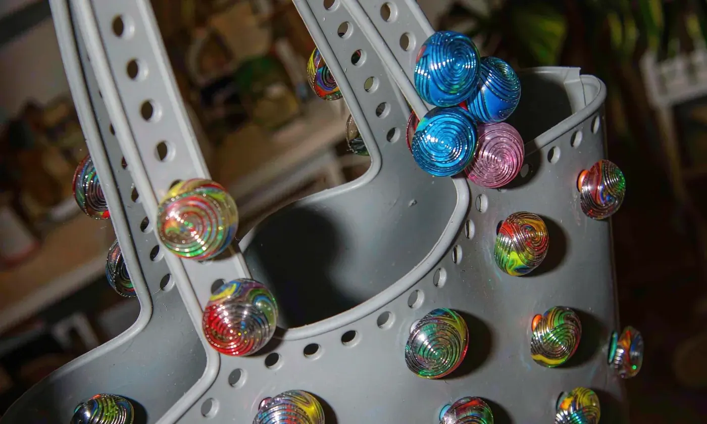
Accessories are where a colour range becomes a system rather than a list, and they are cheap to add because they do not carry a new body minimum. The rule that works is contrast at the charm and tone at the strap: a charm one or two steps away from the body colour reads as deliberate, while a strap in the same family keeps the silhouette calm. A charm in the identical shade disappears in photographs, which is the most common styling mistake in this category.
| Body colour | Charm direction | Strap direction | Effect |
|---|---|---|---|
| Shell or off-white | Any bright or a metallic | Sand or pale grey | Bright charm becomes the focal point |
| Pale sand or stone | Coral, deep teal or gold | Driftwood grey | Warm and coastal, photographs well |
| Hot pink or tangerine | White, lemon or aqua | Matching body tone | Candy read, strong on social |
| Navy or deep teal | Gold, cream or blush | Slate or black | Premium and urban, hides wear |
| Sage or olive | Butter, terracotta or cream | Deep fern | Garden read, works off-season |
| Marble or two-tone | Pull the lighter tone from the body | Pull the darker tone | Ties the pattern together |
Charms also solve a practical problem that colour alone cannot: identification. On a crowded pool deck or in a shared rental, a body in a common neutral is hard to tell apart from six others. A charm or a coloured tag identifies a bag from ten metres without opening it, and it costs a fraction of differentiating the body itself.
Colour Matching: Pantone, Tolerance and Batch Codes
Colour matching on a moulded compound is approximate in a way that matching on fabric or on printed packaging is not. Fabric is dyed from a recipe and can be adjusted in small steps; a compound is pigmented and then heat-processed, and the processing itself shifts the final shade. The realistic tolerance is a delta E of 1.5 to 3.0 against the target under standard lighting, and anything tighter than that should be treated as a bespoke development project rather than a standard match.
| Stage | What happens | Tolerance to expect | What you approve |
|---|---|---|---|
| Pantone or physical reference supplied | Target recorded before development | Not applicable | The reference itself |
| Lab dip or first shot | Compound mixed and moulded | Delta E 2.0 to 4.0 | Direction, not final shade |
| Second shot after adjustment | Recipe corrected | Delta E 1.5 to 3.0 | The production target |
| Approved reference chip | Signed and retained by both sides | Becomes the standard | The chip, in duplicate |
| Bulk production | Full batch against the chip | Delta E within 3.0 | Pre-shipment sample |
| Repeat order six months later | New batch against the same chip | Delta E within 3.0, often closer | Pre-shipment sample again |
Two operational points follow. Keep a signed reference chip and quote its batch code on every reorder, because verbal colour descriptions drift over a year. And order all planned stock for a season in one release where possible, because even within tolerance a second batch will sit slightly differently next to the first on a shop floor.
Light Fastness: What the Number Actually Means
Light fastness is quoted as a grey scale grade, usually from 1 to 5 with 5 being no change, and it is measured by exposing a sample alongside a standard under controlled light and comparing the shift. In this category a grade of 4 or better is the target for any colourway intended for outdoor use. Grade 3 colourways are acceptable for shaded or urban use and will show visible shift after one to two seasons of strong sun.
Colour fastness to light and to rubbing is assessed by grey scale methods published by AATCC, and the corresponding international series of fastness tests is published by the International Organization for Standardization. A buyer does not need to commission either test for a standard range, but asking a programme partner which grade a specific colourway is rated at is reasonable, and a partner who cannot answer is quoting a pigment rather than a specification.
How Colour Reads on Screen, Which Is Where It Sells
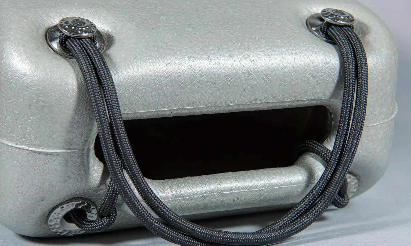
Almost every colour decision in this category is now made on a phone screen, and a screen renders a moulded compound differently from the way an eye sees it. Saturated brights read brighter and slightly cooler on a backlit display, mid-tones flatten, and a matte finish photographs as a different product from the same body in gloss. Three adjustments close most of that gap, and none of them requires a studio.
| Screen problem | Why it happens | Correction | Effect on returns |
|---|---|---|---|
| Brights look neon | Backlit displays boost saturation | Shoot in open shade, not in sun | Fewer colour mismatch returns |
| Mid-tones look flat | Limited dynamic range on a phone | Add a shadow line and a highlight | Better perceived depth |
| Matte reads as dull | Diffuse reflection removes the sheen | Side light at 45 degrees | Matte reads as premium |
| Gloss shows every mark | Specular reflection picks up dust | Wipe and shoot last, or use matte | Fewer condition complaints |
| White blows out | Auto exposure on a bright subject | Expose down by two thirds of a stop | Accurate shade against the chip |
The commercial point behind the table is that colour mismatch is one of the largest single drivers of returns in online soft goods, and in this category it is almost entirely a photography problem rather than a production one. Shooting in open shade, exposing down slightly for pale bodies and keeping one reference shot of the approved chip alongside the product shot will do more for return rates than any change to the compound.
Seasonality: When to Introduce a Colourway
Colourways have seasons even when the body does not, and the calendar is tighter than most ranges plan for. In a northern market the selling window runs roughly from late April to early August, which means artwork approval in January and stock on hand by early April. Introducing a new colourway in June is a decision to sell it for six weeks and then hold it until the following spring.
| Month | Action | Lead time to stock | Window it serves |
|---|---|---|---|
| September to October | Review sell-through, choose next palette | Not applicable | Planning for next spring |
| November to December | Develop and approve new shades | 120 to 150 days to stock | Next spring season |
| January | Place the spring order | 90 to 110 days to stock | Late April opening |
| February to March | Photography and listing build | 60 to 80 days to stock | Pre-season launch |
| April to July | Sell, review at week six and twelve | In season | Peak eight to ten weeks |
| August | Mark down, plan the following year | Not applicable | Off-season clearance |
Two consequences follow from that calendar. A new shade developed in November cannot be adjusted in March, so the first shot has to be right rather than approximately right. And a colourway introduced for a single season should be ordered once, because a reorder placed at the start of peak arrives after the eight to ten week window and lands into clearance.
One practical check closes the loop between the screen and the warehouse. Keep the approved reference chip in the shot and compare the on-screen rendering against it before the listing goes live, because a shade that sells well in a photograph and disappoints in the hand generates a return and a review, and both cost more than the extra hour spent checking the image.
How Many Colourways to Launch, and How to Kill One
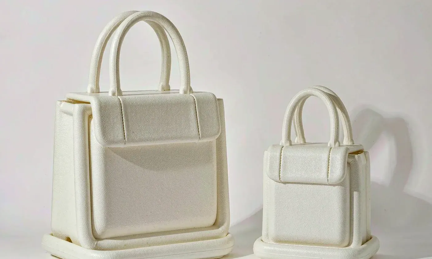
The working answer is three to five colourways per size, with one neutral carrying 50 to 60 percent of the opening buy. More than five and the opening order stops fitting inside a first-season cash budget; fewer than three and the range looks thin on a shelf and in photographs. The discipline is in the review: measure sell-through by colourway at week six and week twelve, and be willing to drop one.
- Set the neutral at 50 to 60 percent of the opening buy. It is the safest reorder and the one that sells year-round.
- Give each bright one 15 to 20 percent. Brights spike in season and flatten out of it.
- Cap any deep tone at 10 to 15 percent unless the channel is urban or off-season.
- Review at week six. A colourway below 40 percent of its pro-rata sell-through will not recover by week twelve.
- Mark down rather than reorder a failing colourway. Holding it for a second season costs more than discounting.
- Promote a proven accent to the next season rather than inventing a new one. Recognition compounds.
The review discipline is what separates a range that compounds from one that resets every year. A brand that keeps a proven neutral and a proven accent and rotates only the third colourway builds recognition across seasons, while a brand that redesigns all three each year is effectively launching for the first time every spring.
Programme Notes
The full category background sits in the injection-molded EVA tote guide, decoration and colour placement options are covered in the custom EVA tote guide, and artwork placement across a coloured body is set out in custom EVA tote printing. QUANZHOU JUNYUAN BAGS has run waterproof bag programmes since 2014 with a founding team in this trade since 2004, and develops colourways against signed reference chips for retail, resort and private label accounts.
Monthly output runs at 200,000 units verified by SGS, operations follow BSCI and ISO 9001, materials are screened for REACH and California Prop 65, and every bulk shipment is inspected at AQL 2.5 before release. Programme minimums begin at 500 pieces per design and colour, with sampling at 6 to 10 working days and bulk at 35 to 50 days from approved sample and deposit, shipped FOB Xiamen or DDP to more than 100 countries. Send your palette references, colourway split and target market to service@junyuanbags.com.
People Also Ask
Which EVA tote colours sell best?
Light neutrals lead in coastal and resort markets, with one bright as the accent. Deep tones sell in northern and urban channels.
Do dark EVA totes get too hot in the sun?
Yes. A dark body reaches ambient plus 22 to 30 degrees and passes sixty degrees within an hour in peak summer sun.
How many colourways should a new range launch with?
Three to five per size, with one neutral carrying 50 to 60 percent of the opening buy.
Can a brand match a specific Pantone shade?
Yes, to a delta E of about 1.5 to 3.0 against a signed reference chip. Anything tighter is a development project.
Do bright colours fade faster?
Some do. Bright organic reds and fluorescent tones shift within a season, while mineral earth tones hold grade 4 or better.
Should charms match the bag colour exactly?
No. A charm one or two steps away from the body reads as deliberate and makes the bag identifiable from a distance.
Frequently Asked Questions
Q1. What are the main EVA tote colour palettes for 2026?
Coastal neutrals, candy brights, deep marine, sunset gradients, garden greens and soft pastels. Three of them cover most ranges.
Q2. Which colour is safest as the volume driver?
A light neutral such as shell, sand or pale stone. It sells year-round, stays comfortable to lift and reorders predictably.
Q3. Do dark colourways fade or overheat?
They overheat rather than fade. A dark body runs ambient plus 22 to 30 degrees and passes sixty degrees within an hour in peak sun.
Q4. How accurate is colour matching on a moulded body?
Expect a delta E of 1.5 to 3.0 against a signed reference chip after a first and second shot. Fabric-level precision is not achievable.
Q5. Can I reorder a colourway and get the same shade?
Close, within a delta E of about 3.0, but rarely identical. Quote the original batch code and keep a signed chip.
Q6. What is a marble finish and is it reorderable?
Two compounds mixed in the mould so each unit is unique. It looks premium but cannot be batch matched, so avoid it on a volume colourway.
Q7. How many colourways should I launch with?
Three to five per size. One neutral at 50 to 60 percent of the buy, two accents splitting the remainder.
Q8. Which colours suit a resort channel?
Shell, sand, pale blue and coral. Resort buyers reject dark bodies because a guest lifting a hot bag leaves a review.
Q9. Do fluorescent tones hold up outdoors?
They fade visibly within a season. Use them for short promotions and events rather than for a year-round colourway.
Q10. How should I choose charm colours?
One or two steps away from the body colour. An identical shade disappears in photographs and does nothing for identification.